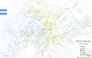
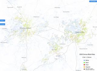
A researcher at the University of Virginia has created a fascinating color-coded map showing where we live by race using 2010 census data. Below are screen shots of the Winston-Salem area and the Piedmont Triad:
Discover more from Befuddled
Subscribe to get the latest posts sent to your email.

